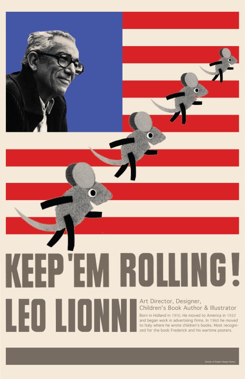
Riley Hollobaugh
First year graphic designer at Seattle Central Creative Academy.
Category: Graphic Design
Image | February 12, 2013
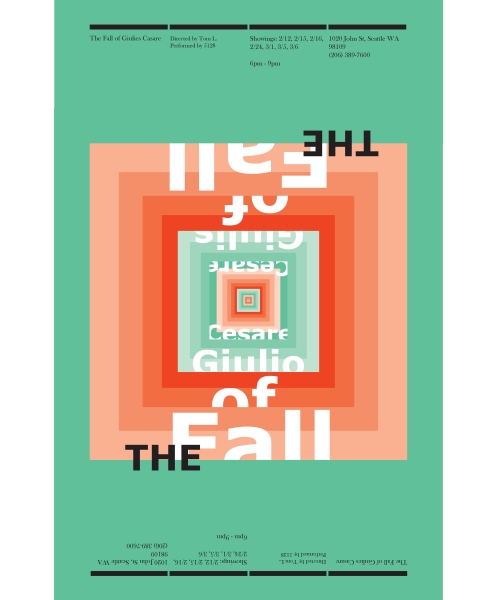
A quick poster for a homework assignment. I used a complementary color scheme of blue-green and red-orange. The different tints of the two hues give the poster a sense of dimension.
January 1, 2013
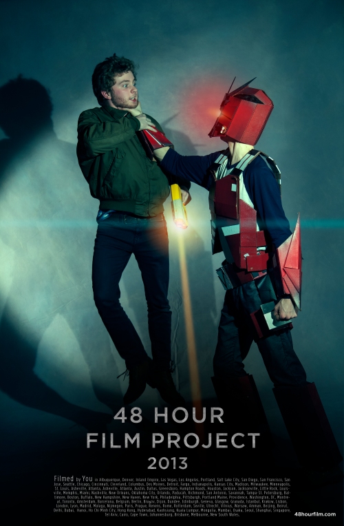
48 Hour Film Project
My final project for 1st quarter graphic design class was to design a poster for the 2013 48 Hour Film Festival. For those of you who are not familier with the event, the 48 Hour Film Project is a once a year event that happens in cities across the globe: Seattle, New York, London, Beijing, Osaka etc…, the event challenges amateur fim makers along with pros to form a team and write, film, edit and present a short film in just 48 hours. Each team is randomly given a character, a prop, a line of dialogue and a genre that they must include in their film. After 48 hours the film is due and is presented in a local theatre.
After researching all this I really want to participate in the actual event. I’ve been apart of a 24 Hour Play Project and these kind of events are a blast. I would highly recommend getting involved in the Film Project.
Back to the assignment. After a week of research I had quite a few different concepts. Ranging from focusing on how international the project was down to how chaotic trying to execute each shot would be. After group critique with fellow classmates I remembered the quote that began the Film Project in the first place “Would films made in only 48 hours even be watchable?” BAM, I thought of a new concept: What would a Hollywood movie look like if filmed in 48 hours? From there with the help of my classmates we had the idea of making a poster series based on that concept. Each poster would be a different Hollywood movie from a different genre. It was a great idea but with the time at hand (2 weeks) I only had time to execute one poster. I decided to make a poster based off “What would the Transformers look like if filmed in 48 hours?”
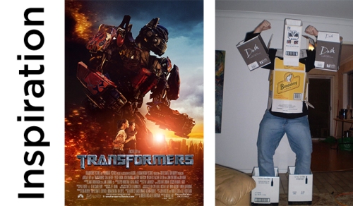

Photo Credit- Vickie Mao
I decided that the best way to execute this poster was to make it look like a actual movie poster and to do that I needed a photo. Instead of just looking online for a photo that would match the concept in my head I took on the challenge to execute the photo myself. I’ve never done this before and I’m not a photographer so I was lucky to get the help of the amazing photographer Vickie Mao. The next thing I needed was transformer like armor made out of cardboard. I wanted it to look like it was whipped together with limited time. And coming to my rescue was Nikita Shea, out of nowhere she had a old co-worker that actually happened to make cardboard armor on his free time. The only scary part was that I couldn’t see what the armor looked like until the day of the shoot. Luckily it exceeded all of my expectations. After only a hour or two of shooting with the help of my good friend Brendan, I had the photo I needed. And the following week with help from the photoshop-wizard Galen Drew. I finished the poster.
The creation of this poster was a great experience. It really enforced how much I love working with people and how much I need to work on typography….
This poster would not have come to life without the help of my awesome friends. Thanks guys!
November 20, 2012
Logo Assignment

The first logo assignment for Intro to Graphic Design. The task was to design a logo for the made up car company called “Green car”. When approaching this assignment I focused on splitting up the two words, green and car. After a couple brainstorms I decided the concept behind green meant “protecting the environment”. As for the word car I wanted the logo represent the high class and pride people can have in their car.
With those two concepts in mind I created a shield with a leaf on it to represent “Protecting the Environment” while the emblem like qualities of the shield and the sleek modern font created the feeling of high class and pride.
